
Tag: button


Mozilla: YouTube’s Dislike Button Largely Fails To Stop Unwanted Recommendations
AmiMoJo shares a report from the Mozilla Foundation: YouTube’s user controls — buttons like “Dislike ” and “Not interested” — largely fail to help users avoid unwanted recommendations like misinformation and violent content, according to new research by Mozilla. An accompanying survey also found that YouTube’s controls routinely frustrate and confuse users. Indeed, Mozilla’s research found that people who are experiencing unwanted recommendations and turn to the platform’s user controls for assistance prevent less than half of unwanted recommendations.


This is especially troubling because Mozilla’s past research shows that YouTube recommends videos that violate its very own community guidelines, like misinformation, violent content, hate speech, and spam. For example, one user in this most recent research asked YouTube to stop recommending war footage from Ukraine — but shortly after was recommended even more grisly content from the region. The study, titled “Does This Button Work? Investigating YouTube’s ineffective user controls” is the culmination of months of rigorous qualitative and quantitative research. The study was made possible by the data of more than 20,000 participants who used Mozilla’s RegretsReporter browser extension, and by data about more than 500 million YouTube videos. These are the top findings, as highlighted in the report:
People don’t trust YouTube’s user controls. More than a third (39.3%) of people surveyed felt YouTube’s user controls did not impact their recommendations at all, and 23% felt the controls had a mixed response. Said one interviewee: “Nothing changed. Sometimes I would report things as misleading and spam and the next day it was back in […] Even when you block certain sources they eventually return.”
People take matters into their own hands. Our study found that people did not always understand how YouTube’s controls affect their recommendations, and so took a jury rigged approach instead. People will log out, create new accounts, or use privacy tools just to manage their YouTube recommendations. Said one user: “When the Superbowl came around … if someone recommended a particular commercial, I used to log out of YouTube, watch the commercial, and then log back in.”
The data confirms people are right. The most “effective” user control was “Don’t recommend channel,” but compared to users who do not make use of YouTube’s user controls, only 43% of unwanted recommendations are prevented — and recommendations from the unwanted channel sometimes persist. Other controls were even less effective: The “Not Interested” tool prevented only 11% of unwanted recommendations.
YouTube can fix this problem. YouTube has the power to confront this issue and do a better job at enabling people to control their recommendations. Our research outlines several concrete suggestions to put people back into the driver’s seat, like making YouTube’s controls more proactive, allowing users to shape their own experience; and giving researchers increased access to YouTube’s API and other tools. Further reading: YouTube Targets TikTok With Revenue Sharing For Shorts, Partner Program Expansion
Read more of this story at Slashdot.
Google teases new face and Google Assistant button for its upcoming Pixel Watch
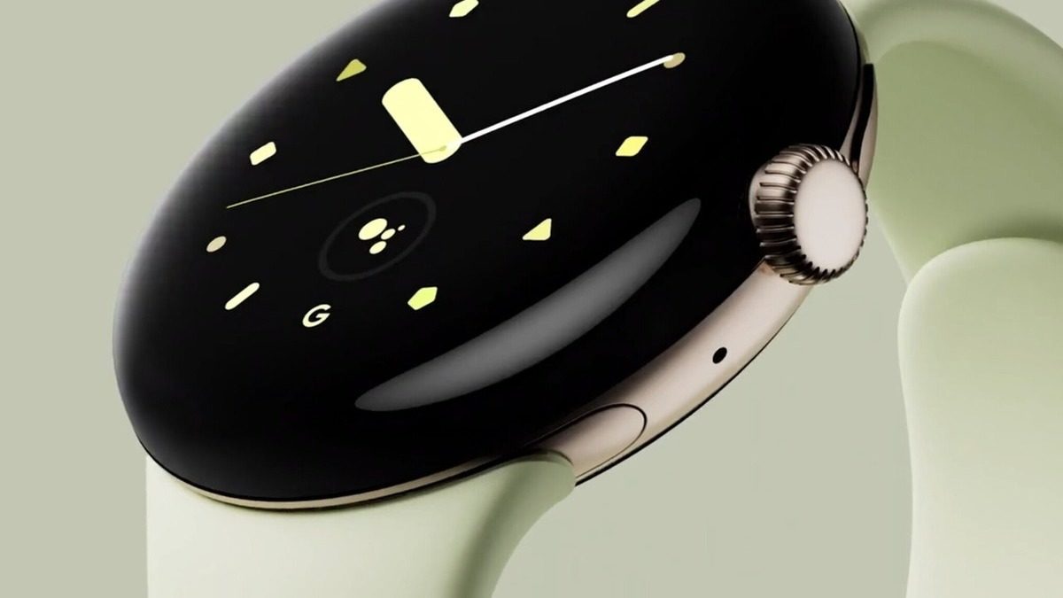
Google has revealed a new watch face and a Google Assistant button on the Pixel Watch.
Study suggests YouTube’s dislike button isn’t doing what you want it to do
Mozilla researchers claim that YouTube’s moderation tools are ineffective as people still get unwanted videos in their feed.
Sorry ‘Little Mermaid’ haters, YouTube’s dislike button doesn’t really do anything

YouTube’s removal of dislike counts in November 2021 led to a massive uproar from the community. But a new report from the Mozilla Foundation says that the dislike button doesn’t do much to change the YouTube experience anyway.
The report, released today, found two main problems with the tools that YouTube gives users to indicate that they no longer wish to see a certain type of content. First, it’s unclear what each tool does and second, using those tools doesn’t affect recommendations as strongly as users expect they will.
The foundation tracked the YouTube experience of 22,722 people and surveyed 2,758 of them about their experience with the content they saw on their feeds. More than 39 percent of those surveyed expressed feeling that YouTube’s user controls did not impact their recommendations at all, and 23 percent felt the controls had a mixed response.
The results of the research supported those sentiments, finding that clicking “don’t recommend channel” led to the prevention of 43 percent of bad recommendations, removing a video from your watch history led to 29 percent, clicking the dislike button led to 12 percent, and clicking “not interested” led to 11 percent.
Basically, users felt that YouTube didn’t listen to them because it doesn’t. That’s bad news for everyone except for the people who disliked the Little Mermaid trailer. In their cases, I hope they continue to get Halle Bailey content recommended to them until the end of time.
You can read Mozilla’s summary of the report at this link and access the full report here.
Apple Watch Pro will have an extra button, leak suggests
Apple is expected to unveil a Pro version of the Apple Watch on Wednesday, and a new leak suggests the device will include an extra button that you can program.
Apple Watch Pro renders and leaked cases show off a larger screen and new button
As expected, the Apple leaks are coming in strong as we’re approaching Wednesday’s “Far Out” iPhone 14 event. Today, we’ve got our closest look yet at the Apple Watch Pro, thanks to renders from 91mobiles. Typically we’d treat most leaks from unknown “industry sources” with a healthy dose of salt, but according to Bloomberg’s Mark Gurman, the renders are “indeed it.” And for the most part, it’s everything we expected. There’s a bigger screen, as Gurman’s earlier reports have suggested, as well a minor evolution of the Apple Watch Series 7 design. (Sorry, flat edge fans.)
Take a close look and you’ll notice an extra button on the opposite side of the (ruggedized) Digital Crown and multitasking button. Both 91mobile and Gurman speculate that it could be programmable, allowing you to launch a specific app or workout without dealing with the touchscreen. Case leaks from Sonny Dickson and DuanRui (via The Verge and Weibo) also point to a larger screen and additional button.
source: https://t.co/0YGp7Nc52zpic.twitter.com/OWNv7DvyNd
— DuanRui (@duanrui1205) September 5, 2022
The Apple Watch Pro will likely target extreme sports fanatics—the sort of folks who wouldn’t mind spending close to $1,000 for Garmin’s high-end smartwatches. While that may sound extravagant, don’t forget that there have always been high-end Apple Watch models not meant for mortal wallets. The current Hermes Series 7 collection ranges all the way up to an eye-watering $1,759. So with that context, maybe a $1,000 Apple Watch Pro doesn’t seem so crazy? (No, it’s still crazy.)
Apple Watch ‘Pro’ CAD Renders Show Flat Screen Design With Extra Button, Protrusion Housing Digital Crown and Side Button

New CAD images of the upcoming Apple Watch “Pro” have been shared online by 91mobiles, providing a closer look at the alleged design of the device.
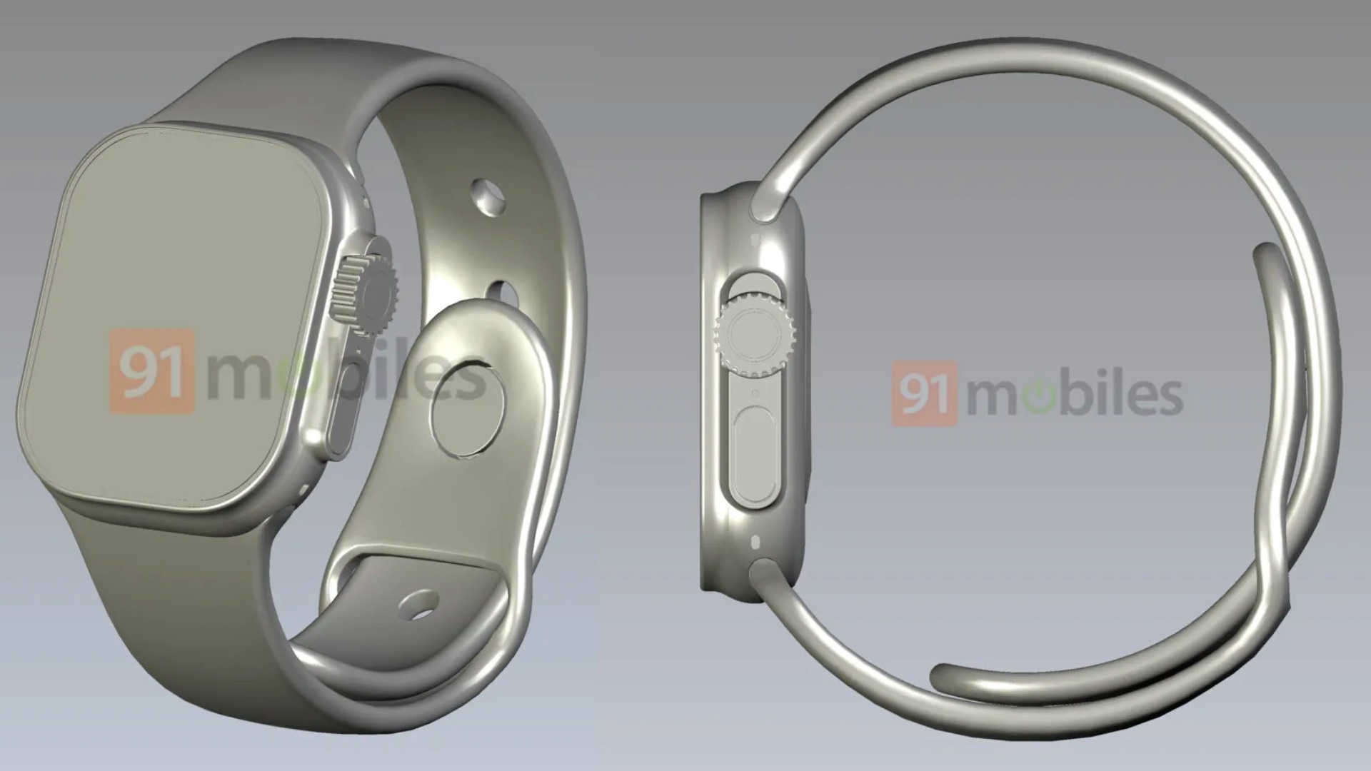
The renders line up with Apple Watch “Pro” case images shared earlier this morning, revealing the inclusion of a new physical button on the left side of the watch. The new button is visible within the CAD images, which show it sitting beneath three holes likely to be the speaker vents.
As for the Digital Crown, the CADs reveal a much more rugged look for the dial compared to the current version. Both the Digital Crown and Side Button appear to be housed within a new chassis protrusion on the side of the Apple Watch Pro, which could make them more easily accessible. The display on the watch is completely flat, unlike the Apple Watch Series 7, which features curved edges around the display.
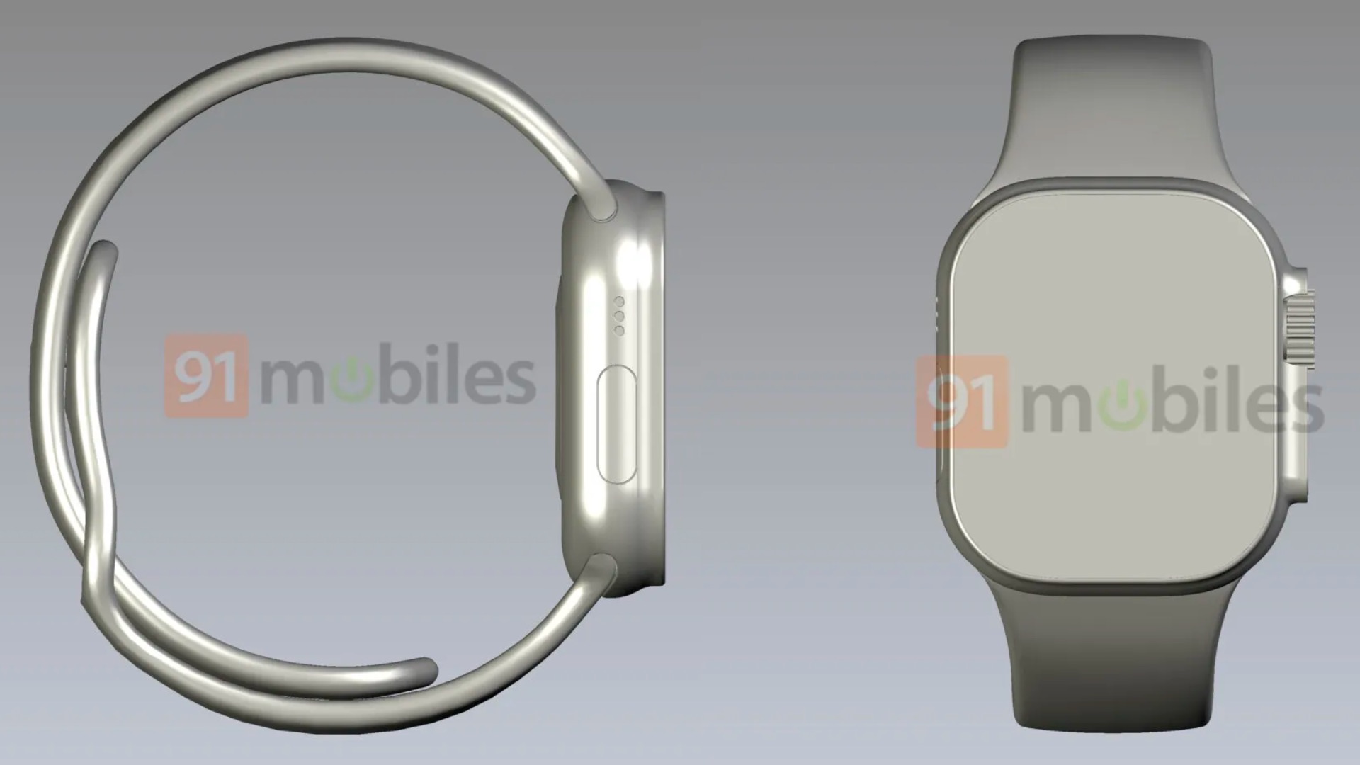
In his Power On newsletter this weekend, Bloomberg‘s Mark Gurman said that the Apple Watch “Pro” will feature a significantly larger display that will likely “be bigger than most wrists.” Past rumors have suggested a case size between 47mm and 48mm for the device. Apple plans to use the larger display to display additional metrics to athletes during workouts, and there will also be redesigned watch faces, according to Gurman.
The new Pro model will sit at the top of the Apple Watch lineup, with pricing expected to fall in the $900 to $1,000 range. Apple is expected to announce the all-new Apple Watch “Pro” during an event on Wednesday, September 7. The new high-end Apple Watch will join the new Apple Watch Series 8 and an updated Apple Watch SE in the lineup.
Update: Bloomberg‘s Mark Gurman says the renders shared by 91Mobiles accurately depict the design of the Apple Watch “Pro.”
Related Roundup: Apple Watch Series 7
Tag: Apple Watch Pro
Buyer’s Guide: Apple Watch (Caution)
Related Forum: Apple Watch
This article, “Apple Watch ‘Pro’ CAD Renders Show Flat Screen Design With Extra Button, Protrusion Housing Digital Crown and Side Button” first appeared on MacRumors.com
Discuss this article in our forums
This Week in Apps: Twitter’s edit button, BeReal clones, Trump’s Truth Social gets blocked
Welcome back to This Week in Apps, the weekly TechCrunch series that recaps the latest in mobile OS news, mobile applications and the overall app economy. Global app spending reached $65 billion in the first half of 2022, up only slightly from the $64.4 billion during the same period in 2021, as hypergrowth fueled by […]
Twitter’s edit button is a big test for the platform’s future


Twitter seems to have handled adding an edit button about as well as possible. The edit button biases toward transparency, adding an edit history for every tweet and a big notice saying a tweet has been edited. Users will only have 30 minutes to edit their tweet, and will only be able to do so “a few times.” Twitter’s surely going to be looking closely at those numbers in its testing to see exactly how editable tweets should really be. It’s only coming to paying subscribers of Twitter Blue, and the test is going to start out small. Twitter is being as careful as can be on this one, and seems to have landed in the right place.
Whether Twitter should have an edit button is still a fun and controversial debate. Will some users abuse the…